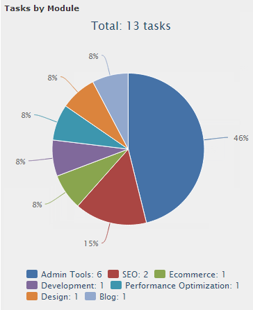
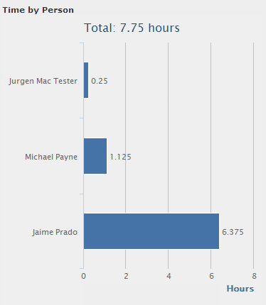
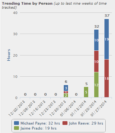
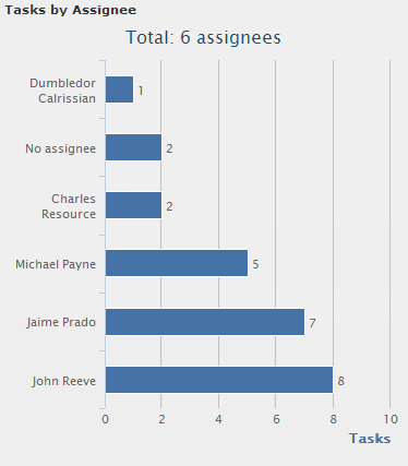
Time tracking and task management graphs in the milestone gives project managers a visual overview of milestone health. Similar to the project dashboard, the milestone graphs will reveal milestone progress by task status, task modules, task assignees, as well as time tracked on milestone tasks broken down by person and module. The goal of implementing these graphs is to help project managers keep milestones evenly balanced.
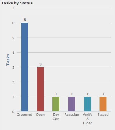
Milestones are the Agile equivalent of sprints. In fact, our development team does all of their sprint planning and management using Intervals and milestones. To keep track of how much work has been completed on a milestone, we’ve added a version of a burn-up chart. The chart lists task statuses in order of priority along the X axis. The Y axis shows how many tasks are remaining for each status. The idea is to have the furthest right task status be the one used for marking a task as done (i.e. Closed, Done, Complete). As tasks change status they will move from left to right, the milestone being completed when all of the tasks are in the furthest right column. Like a traditional burn-up chart, this graph will show how much work has been done to date and will help your team maintain its velocity. To checkout the graph navigate into the view page for a milestone and then click on the graphs tab.
The tasks by status graph is a kanban-styled graph. As milestone begins, most of the tasks will start out in the left column:
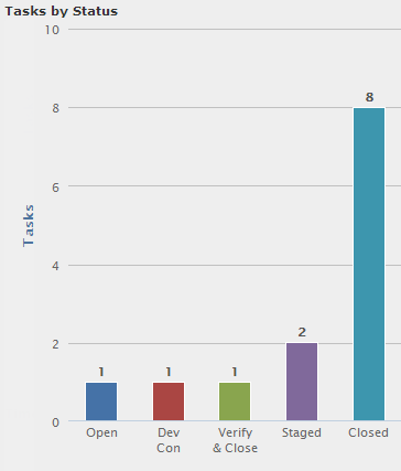
But as the milestone progresses, tasks will move to the right of the graph:
Here are some additional milestone graphs samples: