An early adopter customer made the following feature request.
When using the Kanban board sometimes I don't need to use the timers or show detailed information. Is there a way to compact the cards to make the most of the screen real estate?
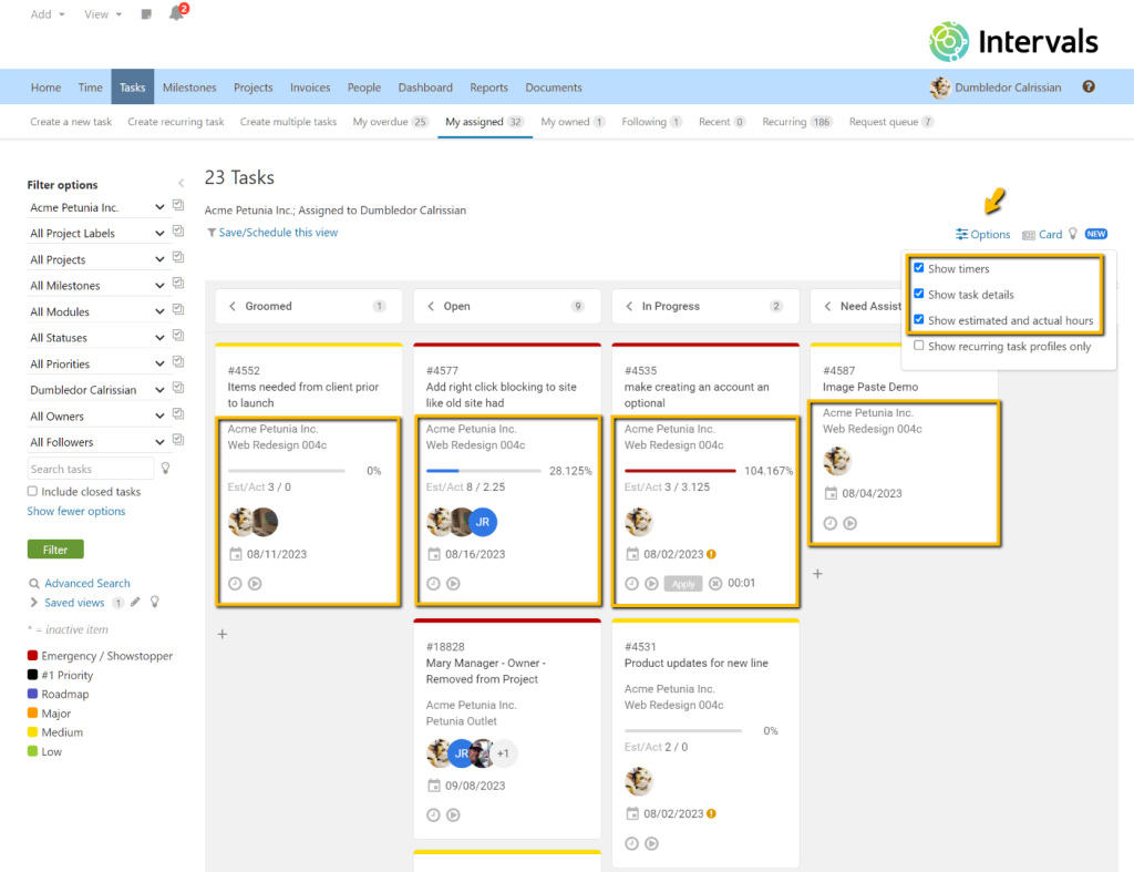
There is. In the “Options” menu there are three options to control the level of detail on the cards. “Show timers” controls whether or not a timer should be displayed on each card, “Show task details” controls whether or not to show client name, project name, and due date, and “Show estimated and actual hours” controls whether or not to show the time progress bar and estimated and actual hours.
Options Menu
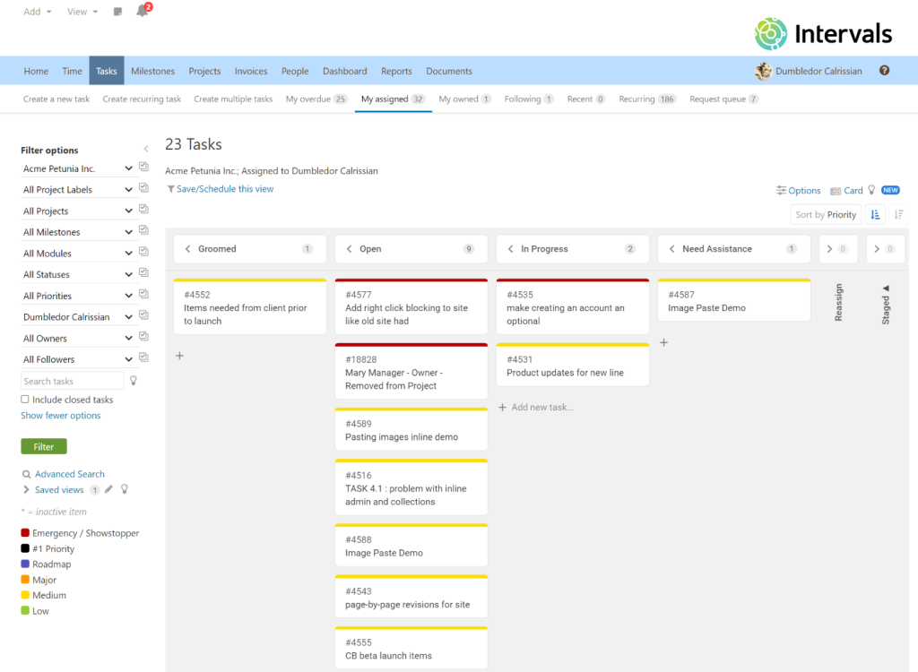
The items are selected by default but if you uncheck both checkboxes the task cards compact down to only show the task number and title. Here is how the minimized Kanban board looks.
Compact Cards
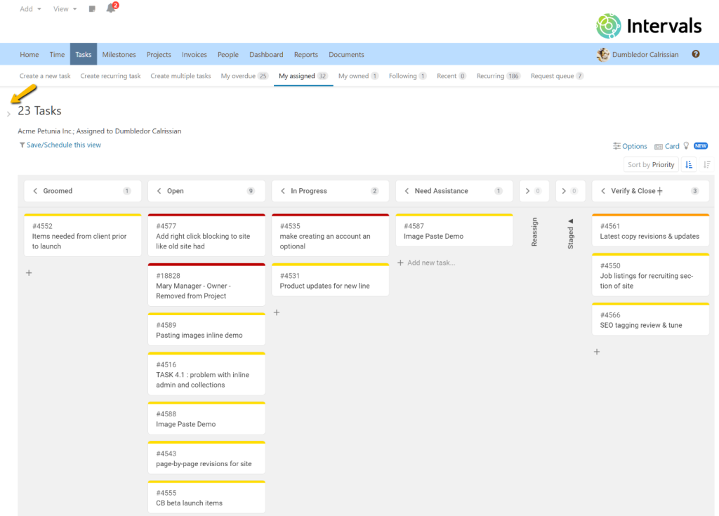
If you need even more screen real estate, the filter menu can be collapsed by clicking on the drape icon.


