***Dark Mode is coming soon for the new CORE theme.***
I would like to be able to change the page color scheme to a darker, less eye straining shade of grey or other color combination. White is too bright for my eyes. Do you plan to add dark mode?
Yes we do. Unlike the visual theme editor that administrator level users can use to customize the appearance of the account, dark mode is a per user setting, similar to how the calendar orientation works.
Navigate to My Account to enable dark mode:
Then, edit the Login Information block:
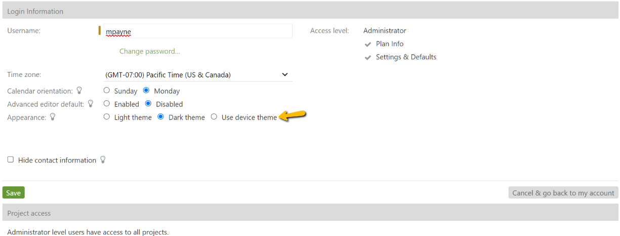
Select dark mode or opt to have dark mode auto enable by detecting your system settings:
Appearance options explained:
Light theme
This is the default option. It uses the unmodified visual theme from your account.
Dark theme
This option applies dark mode exclusively.
Use device theme
This option applies the dark mode setting from your operating system or mobile phone. Use this setting if your device is set to enable dark mode depending on the time of day.
Dark mode and the mobile app:
These settings also apply to the Intervals mobile app on Android and iOS devices. If you set your account to “Use Device Theme” the Intervals mobile app will switch to dark mode at the same time your device does.
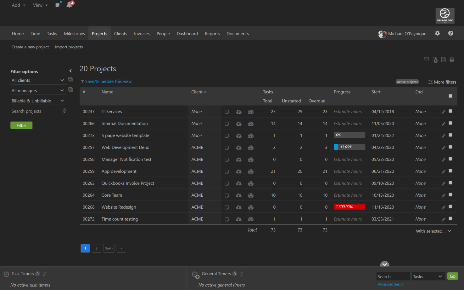
This is an example of what the project listing looks like when your account is in dark mode.
This feature was added because of our customer feature request submissions. If you have any thoughts on how we can improve this feature, please submit a feature request and let us know.
Note: If your account uses the advanced theme editor and has modified the CSS, dark mode may not look as intended. Additional CSS modifications may be necessary to make dark mode match your company’s brand.


