## Update ##
The Periscope report has been replaced by the Gantt chart.
Please visit this Gantt chart help resource to learn more about the Gantt chart.
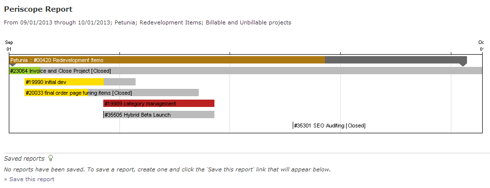
The Periscope Report is a data visualization tool that displays tasks in a similar fashion to a Gantt chart. There are no dependencies, but this is due to Intervals being built around Agile project management philosophies where tasks are more free form in nature and milestones are utilized heavily. The Periscope Report is great at visualizing a project and all of its data in a horizontal bar chart style.
Apart from the standard filters, this report has ability to include or exclude rendering of tasks and milestones. There is also an extra option with this project management chart to display closed tasks in case you need to see them.
For tasks, the progress meter color signifies the tasks’s severity color and if progress is greater than 100%, the color will turn red.
Popular filters:
- All projects YTD
- Billable projects YTD
- Un-billable projects YTD
- All active projects w/ tasks & milestones displaying (current quarter)
- All projects w/ tasks & milestones (current quarter)