Intervals has a lot of reports. While the filter options are mostly the same for creating reports, each one has a different approach to querying and visualizing your data. This article provides an overview of each report to help you decide which report is best for your various needs.
Before we begin, let’s talk about report filters. Every report has a set of filters in the left column and they are mostly the same. The first section of filters determines how the data will be segmented in the report. Options include by client, project, task, person, and more.
The second section of the filters determines the criteria for what data to include in the report. There are options here to include a specific date range, or to include data for only one project or one person. There is also the option to select an arbitrary subset using the multiple icon.
The reports are designed to be extremely flexible and can be run in an infinite number of ways using the filter options in the left column. If you find a report that you would like to review on a regular basis (or send to a client or stakeholder), it can be saved and scheduled for delivery via email. If a report is close to what you need but the results need a little manipulation, all of the reports can be exported to Excel where you can further crunch your data any way you’d like.
The reports in this list are not available to all users. Access to each report is based on the individual’s user level, while the data that appears in each report is based on project permissions. For example, an administrator level user can see all reports and all project data. A manager or resource level user has access to fewer reports, and only sees the data from their projects.
And now, on to the reports.
Mr. Pie Chart
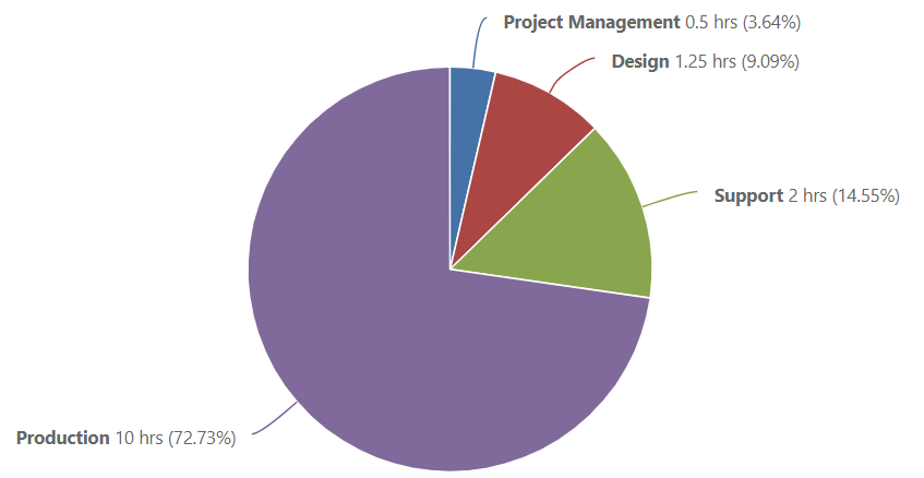
One of our first reports, hence the funny name. This report will segment your time tracking data based on the selected criteria and render a traditional pie chart. This is a great report for doing a comparative analysis across multiple segments. For example, you can quickly quantify the amount and overall percentage of hours each person on your team has tracked this week.
Learn more about using Mr. Pie Chart →
Trends Report
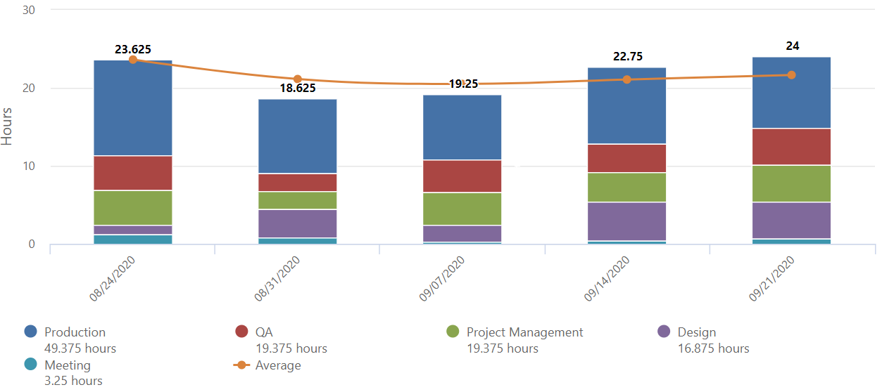
This report will query your historical time tracking data and plot the results on a timeline. The goal of this report is to help identify trends or seasonality in your data, and can be segmented several different ways. For example, this report can reveal which projects have been ramping up recently and requiring more hours than usual. If you bill for your time looking at billable hours only can show you how your billable work is trending.
Learn more about using the Trends Report →
Gantt Chart
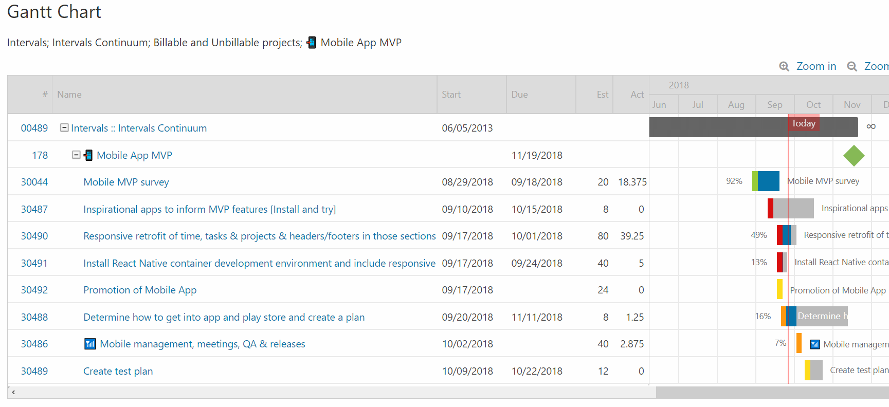
The Gantt Chart visualizes your projects and tasks on a timeline. It, too, can be filtered by client, project, and more, so you can focus in on a smaller slice of your schedule if needed. This is a great report for getting a 10,000 foot overview of your current workload, and will show you what your team should be working on now and in the upcoming weeks and months. If your client needs to be a project plan the Gantt chart can be a valuable tool in your project management toolbelt.
Learn more about using the Gantt Chart →
Project Activity Report
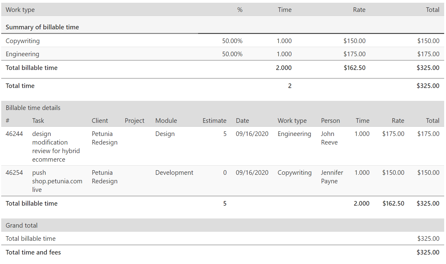
Ever have a client ask you to account for how their money is being spent? If so, this is the report to run to justify your time. The Project Activity report will create a detailed list of every single time entry, along with its billable value, grouped by project, person, task, or date. This report will show you and your clients exactly where your time is going, as well as the value of your time. This report is the ultimate statement of work for a date range.
Learn more about using the Project Activity Report →
Roll-up Report
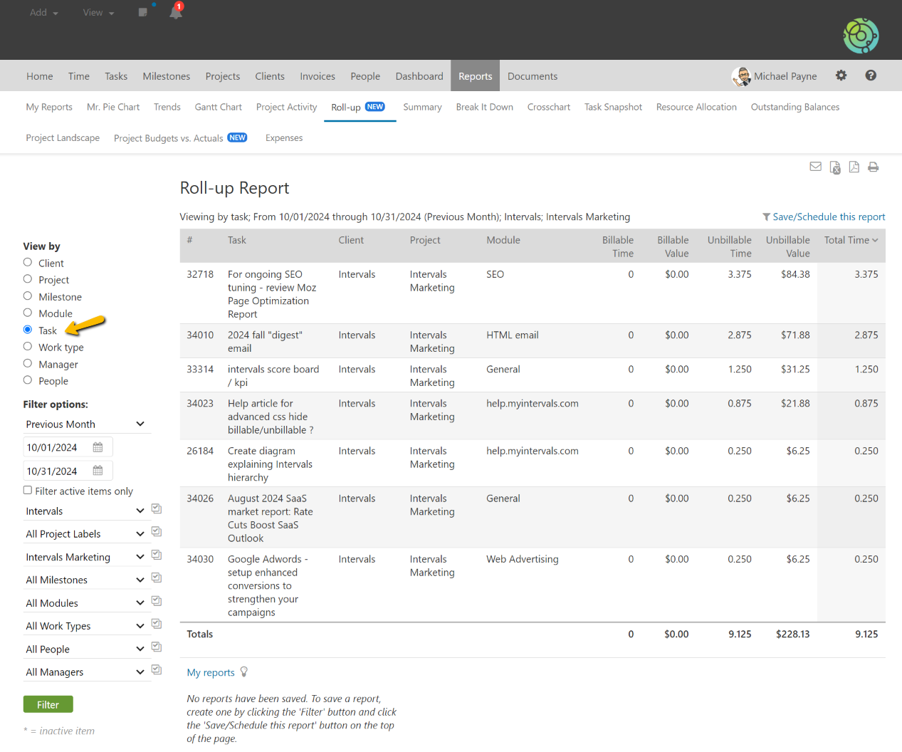
The Roll-up Report balances high-level summaries with granular details. It provides a mid-level view of the hours and value of work performed across tasks, milestones, projects, clients, and more. Use this report to find out how much billable time was spent on each task this month, or, the amount of billable work each project generated in a given quarter. This report highlights the robust reporting capabilities that make Intervals a popular choice amongst data junkies.
Learn more about the Roll-up Report →
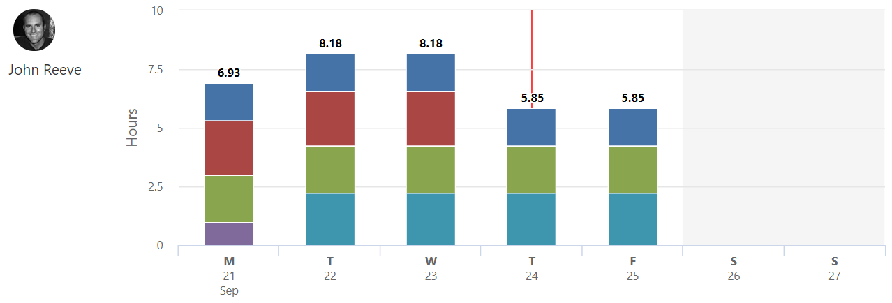
Summary Report
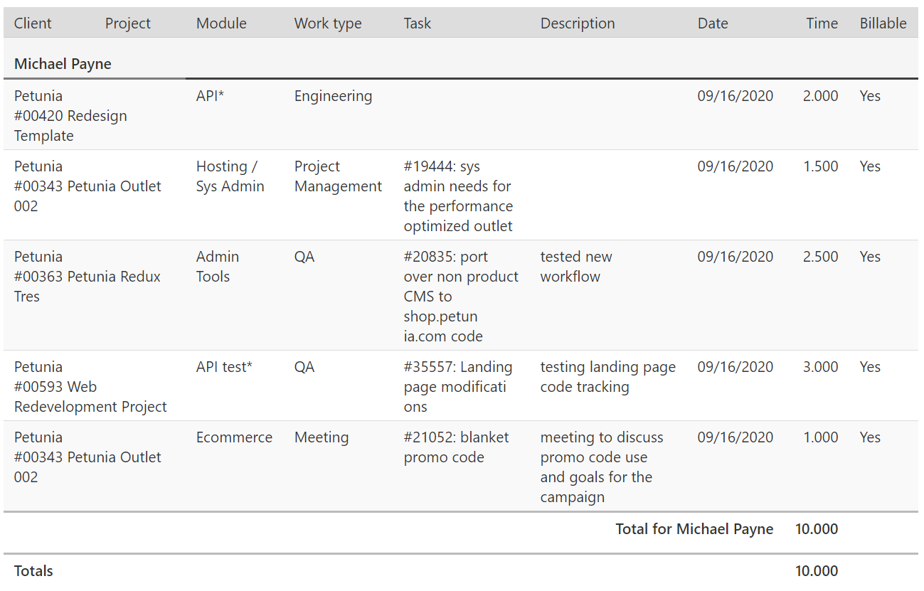
This is one of the few reports that can includes descriptions of each time entry, which makes it most useful when you need the backstory behind where your time is going. The Summary Report not only provides the details of what happened, it shows the task that was worked on and the type of work that was performed. Run this report when you want to know how one person is doing with their current workload. It’s also useful when filtering by one client or project to see how the team has been spending their time on it. If you ever need to run a timesheet for more than one week at a time, the Summary report is your ideal reporting option. The output looks almost identical to a timesheet and you can filter by person, project, client, date range, etc.
Learn more about using the Summary Report →
Break it Down Report
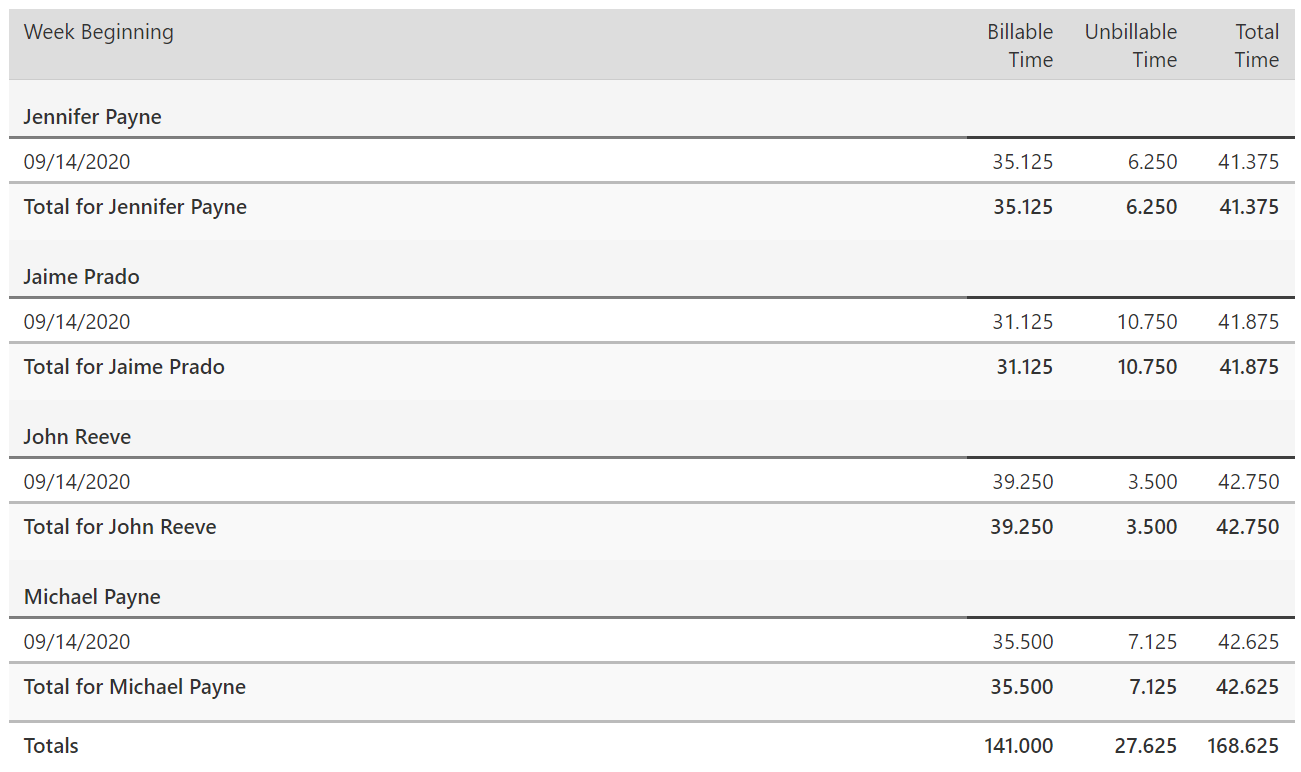
When you need to get a more generalized view of where your time is going, the Break it Down Report is ideal. It’s not a low level or high level report, rather, it provides a mid level summarization of your billable and unbillable time tracking data. The report will group the data however you’d like and can be displayed in daily, weekly, monthly, or quarterly segments. A common use for this report is running a weekly overview of time grouped by person to see if the team is meeting their weekly goals. Another common use is to filter the report by a single client for a daily overview of all their projects.
Learn more about the Break it Down Report →
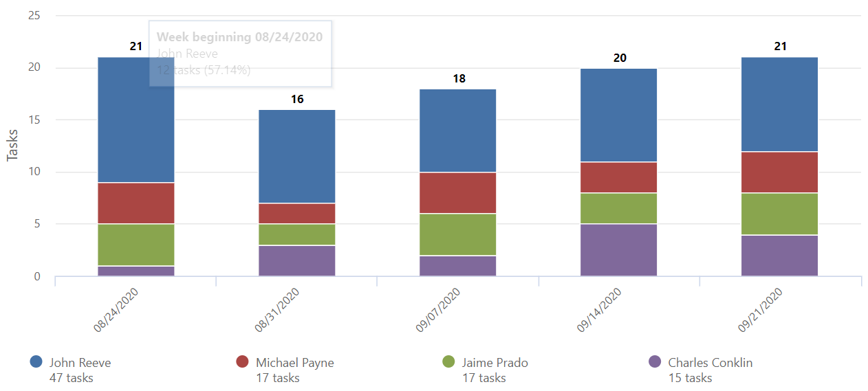
Crosschart
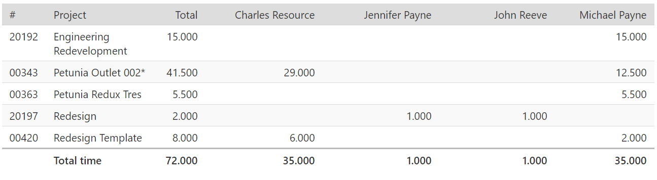
The Crosschart report is named after its ability to crunch your time tracking data using the two cross referenced data points of your choosing. Instead of selecting a single segment to view by, this report lets you choose the X and Y axis. For example, you could cross analyze people and projects to see who is spending the most time on each project and which projects aren’t getting enough attention. We use this report every week for our “weekly goals” meeting and run it by person and tasks to see which tasks each of us are working on and if they line up with our priorities.
Learn more about using the Crosschart →
Task Snapshot Report
There are some teams that would like to know how many tasks are starting, are due, or have been closed over a given date range. The velocity of task throughput can be a useful metric. For example, teams can use this report to create a baseline, then compare their current performance to a similar period in the past. This report is also useful for identifying problematic bottlenecks that may be caused by too many tasks starting or becoming due at once.
Learn more about the Task Snapshot Report →
Resource Allocation Report
Intervals has some lightweight resource allocation features, and this report is one of them. It will plot your team’s tasks on a timeline where the X axis is the number of hours that person is expected to work each day to complete their tasks on time. The Resource Allocation report totals the number of hours estimated on each task, then divides those hours across each of the assignees and days the task is scheduled to run. A task will require a due date, an estimate, and at least one assignee to be included in this report. For example, if a person is assigned an eight hour task to be completed over a span of four days, the report will allocate two hours per day to that person.
Learn more about the Resource Allocation Report →
Outstanding Balances Report
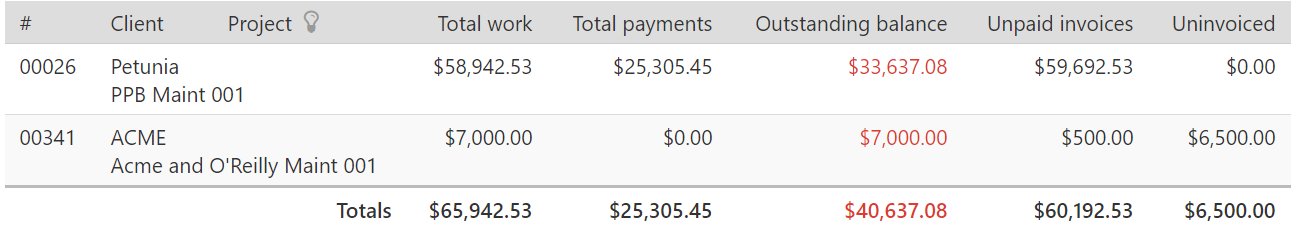
When the amount of billable work on a project exceeds the amount you’ve been paid, the project will appear in the Outstanding Balances report. This report also shows how billable work has yet to be invoiced, along with the balance of already issued invoices that have yet to be paid. The Outstanding Balances report is great for analyzing and regulating cash flow, and knowing when to invoice a client.
Learn more about the Outstanding Balances Report →
Project Landscape Report
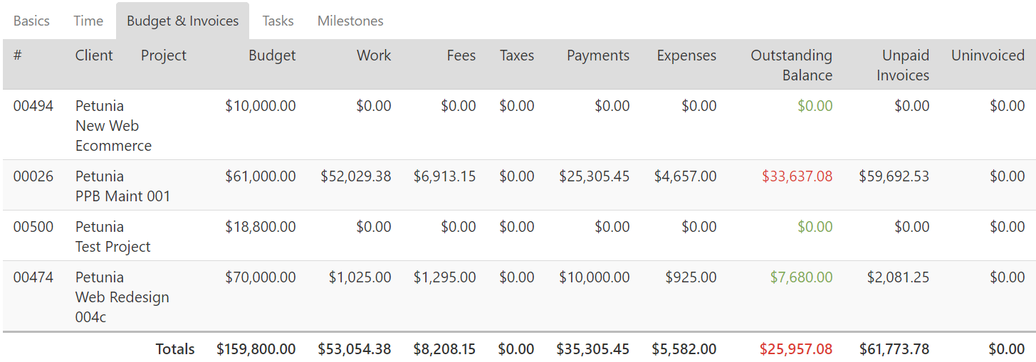
One of our most utilized reports, the Project Landscape report will provide a 10,000 foot overview of current productivity and profitability across all of your projects at once. If any one of your projects is headed for trouble, this report will show it. This report has several sub tabs that are useful for changing up the perspective. For example, the Budget & Invoices tab will reveal the financial health of each project, while the Tasks tab will give you insight into current workload.
Learn more about the Project Landscape Report →
Project Budgets vs. Actuals Report

This report mirrors the Estimated vs. Actual page found within each project. However, the multi-project report offers additional filtering options by client, project label, manager, and more, allowing you to aggregate data across multiple projects.
Learn more about the Project Budgets vs. Actuals Report →
Expenses Report
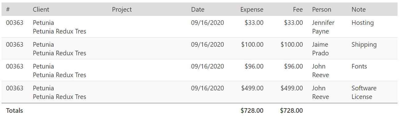
Intervals manages and tracks of your expenses at the project level. The Expenses report, however, provides a quick way to evaluate both current and historical expenses across several projects at once. For example, you may want to view expenses for a given client that has several ongoing projects. Or, you could filter this report by a specific person to see who and how much they’ve expensed.
Learn more about the Expenses Report →